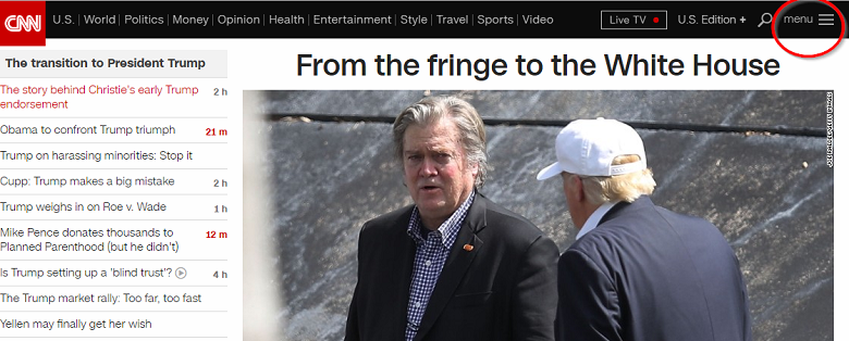
Today’s web designers know that effective development for mobile usage may involve a comparison of hamburgers to hotdogs. The customary “hamburger menu” usually found in the upper left corner of many mobile web pages has become an expected part of this type of design. Some argue just how functional it is. Professional network designers constantly struggle to fit necessary function into tiny spaces for mobile viewing; however, is the hamburger menu the best option?
The Hamburger Menu Explained
The mobile hamburger menu, which is named for its stacked three-bar icon, is the typical navigation found in the left-hand corner of many websites today. It started being used as a way to provide additional guide options for users without cluttering up the small amount off space. This hamburger list has become a universal mobile element used by most web designers.
Want Fries With That Burger?
Most mobile users have come to expect the hamburger icon, understanding they can find additional navigation links not visible on the page under this stacked icon. Users touch the three-bar icon and drop down or flyout links appear without the user having to scroll or swipe, eliminating the need for web developers to put more text into already limited website real estate. Despite this seemingly easy function, many designers argue that hamburger navigation is past its prime, that its approach is not as useful now as it once was. Once viewed as a clean and simple option that provided a neat home for additional links, it should be replaced with a more user-friendly option.
The Down Side
Research on the effectiveness of the hamburger menu does indicate there are a few problems with the idea. Professional web designers opposed to this method are quick to point out how this commonly accepted position in the upper left corner of the website is inefficient for right-handed phone users, requiring the use of both hands.
Secondly, even though the three-bar stacked icon has become universal, many mobile users do not recognize it or even know what it is and must still search the website for desired options. Many buttons are now being placed in a more user-friendly location, breaking the tradition of using the upper left corner. This creates more confusion when users cannot find the menu in its usual spot.
In any one of these situations, whether users cannot find the menu, do not recognize it, or cannot reach it, there is a growing consensus among mobile designers that it is time to do something else.
User-Friendly Options
Considering the main complaints with the mobile hamburger menu, some web designers are looking to more user-friendly options that increase effectiveness without relying on hidden navigation. Some have reintroduced the top guide bar, while others have implemented a bottom list, icon bars, or grids. Still others have moved to tabbed navigation, an option that many designers are finding produces greater user engagement. By plainly displaying options, rather than hiding them behind a tiny icon, user engagement is encouraged and made easier to find.
The decision of whether to stick with the traditional hamburger menu or to seek something that could work better is one that will differ for each mobile network. Depending on the design, required functions, and many other variables, those who create websites must consider how users are most likely to engage and construct navigation accordingly!


